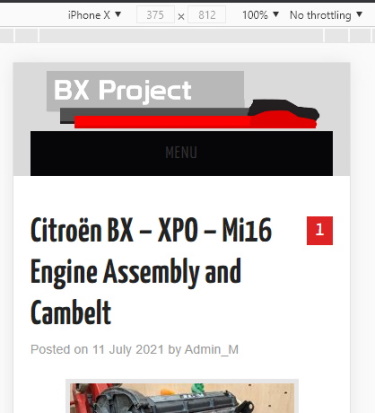
Since the BXProject website became an automotive blog back in 2020, I’ve been unhappy with a key feature of the site. And it’s a problem with more than just the main site. The banner image appears on all the social media and video outlets, and let’s be honest, the design is crap! So in May 2021, I revised the colours and layout on the main site. The new theme has emphasised just how bad the banner image appears. Enough is enough. It’s time to do something about it!
The BX Project banner history
Over the years, the BXProject has had quite a few different images at the top of the website. Back in 2006, it featured one of my favourite pictures of the BX. Taken against the background of the Lake District in 2004, this was my BX at its prime for a long time. But it wasn’t much use for printing.
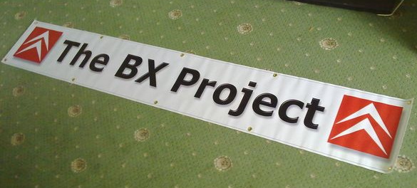
The members of the now-defunct BX Project Forum started to meet at shows. We needed a way for some of these virtual people to identify us in the real world. So in 2009, I significantly simplified the banner image. The revised logo featuring the chevrons and simple text was in use for nearly a decade.
With this new logo being a more straightforward design, it was easier and cheaper to print. So in 2010, I finally had the design made into an actual printed banner that we could hang up along the edge of the gazebo, a calling card to anyone joining the BX Project miss fits.
Redesinging for the BXProject Blog
As I started to develop the BXProject into a WordPress based blog in 2020, I realised there was a massive problem with the existing banner. It’s very ‘Citroen’ orientated and doesn’t give the right impression of the site, which is about all my automotive adventures, not just the ones with the chevrons. So I set about a redesign.
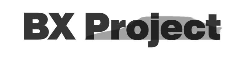
I wanted something that could identify what the blog was about without overly favouring any brand or type of vehicle. ‘BX Project’ isn’t exactly the most descriptive name if you don’t know what a BX is. The first idea, shown above, was terrible. It might have worked in the ’90s, but it still wasn’t any clearer as to what the site was about. Nevertheless, it did have a little bit of promise.
While the initial attempt was awful, it did spawn one idea I liked, the silhouettes. In practice, this could be expanded to add different vehicles. Attempts to add the Fiat X19 and Fergie quickly made the design overly complicated. Unfortunately, I’m not very creative, and while I’m happy developing a theme, I’m hopeless at starting from nothing. In desperation, I followed many guides on making banner images for WordPress and YouTube.
The banner for the Automotive Adventure blog
Something several guides suggested was to use a textured background. And for some unknown reason, I went with it almost in frustration of making no progress but needing something I could at least start with. And so, I formed the new banner image.
After ten years, this was a considerable change. Gone were the Citroen chevron logos, and only a passing reference to the Citroen BX was hinted at. And this image ticked a lot of boxes. I could scale up and down the mottled grey background to meet the long list of YouTube size requirements. The design wasn’t dominated by any particular car either.
Frankly, I’m not too fond of it. It ticks a few boxes, but it doesn’t jump out as automotive related. In addition, the grey background is, well, rather dull. Worst of all, it no longer fits in with the theme of the site. I needed professional help!
Bringing in a professional
For a while now, I’ve been following @RussellJWallis on Twitter. A graphic designer with an evident love of old cars, especially 80’s and 90’s rarities. A quick look on his website also confirms a bit of a Citroen love. Rus appeard to be someone with talent operating on a similar wavelength to my own.
A few emails later and a long list of my desires (regarding the banner, not general desires) and we seemed to be on the right path. We agreed to a very affordable price upfront, and Russ set to work. I suspect it’s no easy task keeping overly demanding clients happy, but I hope it’s easier to work with a long set of desires than none at all!
Initial banner design themes
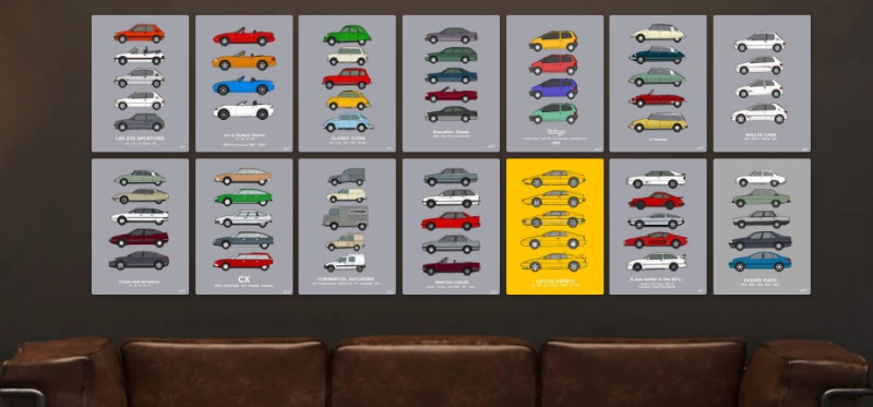
Within a matter of days, Russ had taken the design brief, clearly looked at the website, and sent over a few ideas. And they were glorious. They would fit perfectly with the main site’s theme but were easily scalable to meet Facebook and YouTube requirements. Best of all, they made the content of the site a little bit clearer. So, the three themes;

What a cracking set of ideas. Far better than I could have come up with, yet they felt very familiar. Of the three themes, there was one that stood out more than the others. Theme 2 captured a dynamic car feel without being overbearing.
Creating a mockup of the new banner
Before committing too much to a theme, I wanted to see how the designs might look on the existing website despite the clear winner. The sites theme is dynamic and resizes to fit the device been used to look at the site. The changing appearence means that I have to check how it looks on both a computer and a smartphone.
On a computer, it looks absolutely fantastic. You would be forgiven for thinking the site theme was developed around this banner and not the other way around. But how would it look on a mobile phone?
And on a simulated smartphone display, the Theme 2 proposal looked great! So Russ and I agreed that this would be the theme to develop into a final banner design. I had a few thoughts about it, though, which were quickly included in the design.
Developing the initial idea
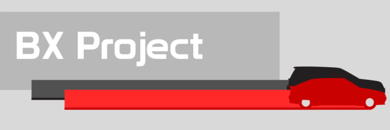
I expected the new banner image development to be a lengthy process of slow iteration, and I could not have been more wrong. In fact, the time and effort put into the design by Russ seemed well over the agreed price. Over the space of a week, the design went through some changes.
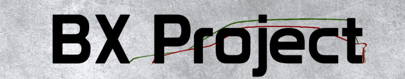
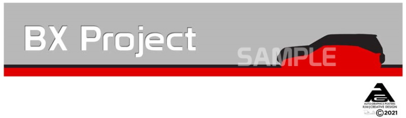
Above is the initial design with the ‘stream of light’ coming too high out of the back of the Freelander, making the dark strip a little too dominant.
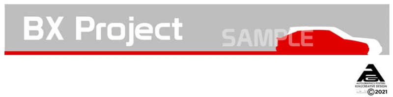
The balance between the black and red ‘stream of light’ looks far more balanced once it only went as high as the vehicles light clusters. Russ also added some wheels to the BX, which made a massive difference in appearance.
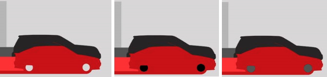
I had a bit of a play with the wheel colours but ultimately agreed that Russ had picked out the initial colour that looked the best. It also better matches the ‘wrong’ colour wheels I have on my BX.
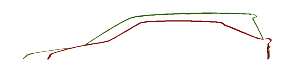
A few more tweaks were made that seem subtle but added some great detail. The gap under the outline of the red car gives a better appearance of it driving and captures the shape of the body kit. The outline of the Freelander wasn’t quite right and seemed closer to that of a Range Rover, which I doubted was included in the price.
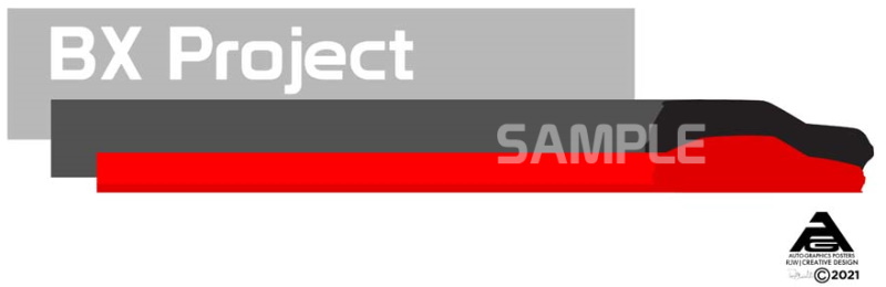
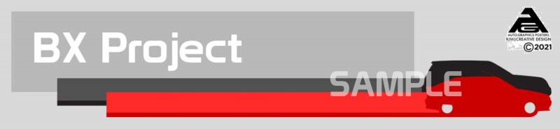
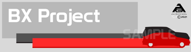
The final banner design
After just 20 days since my original email to Russ, I had a final design to hand. And it’s bloody brilliant! Far better than I had imagined and worth every penny. Sometimes you have to bring in professionals to get the best design.
I’m delighted with how the final design has come out. Some subtle design cues that I would never have thought of. I especially like the ‘stream of light’, but then I love the movie Tron, and there is something very light cycle about the design. Capturing a sense of motion in a still, flat graphic is a great touch.
My thanks to Russell for his patience and great design. And, of course, for letting me share the images of this design story. If you need artwork for your projects, have a look at Russell’s website https://www.rjwcreativedesign.co.uk/ and get in touch if you like what you see. That’s all I did, and I’m happy I did!
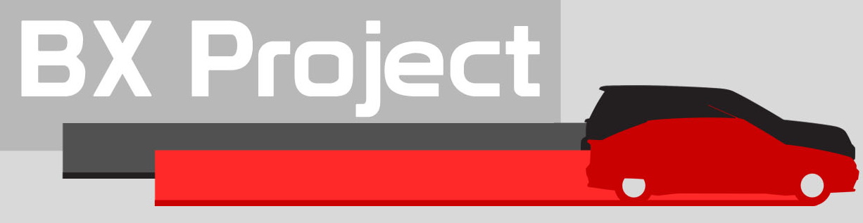
M